

Why Most Record Store Websites Feel Broken
A lot of record store websites are not technically “bad.” They often have the right products, the right name, and a real business behind them. But when you actually try to browse them, they feel broken.
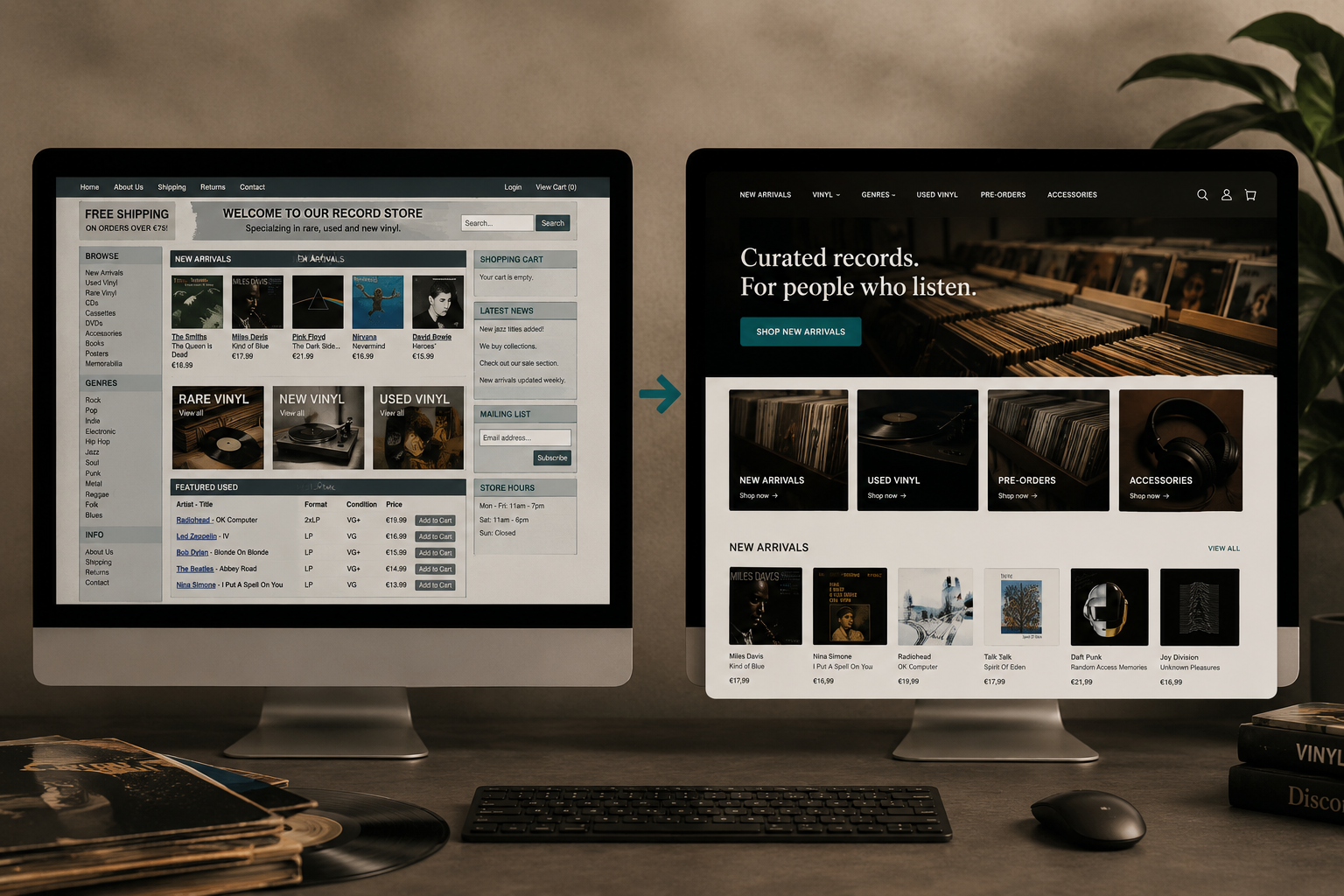
That feeling usually comes from a mix of weak navigation, cluttered product pages, poor mobile usability, and a lack of clear structure. The store itself may be great, but the website does not make that clear.
What “broken” really means
When people say a site feels broken, they usually do not mean it literally crashes. They mean the site is hard to understand, hard to browse, or hard to trust.
For record stores, that often shows up as:
Confusing menus.
Too many clicks to get anywhere useful.
Weak search or filtering.
Poor image quality.
Product pages that feel messy.
A layout that does not guide the eye.
If a customer has to work too hard, the site starts to feel broken even if everything technically functions.
Why this happens so often
Record store websites often grow organically over time. A store starts small, adds products, adds pages, adds promotions, and eventually the website becomes a collection of layers rather than a clear system.
That is why the site may feel like it has been patched together instead of designed as a whole. The problem is usually not the records. The problem is the structure.
Common signs of a broken-feeling site
The most common signs are:
The homepage does not clearly explain the store.
The menu is cluttered or inconsistent.
Categories are too broad or too deep.
Product pages are hard to skim.
Condition, price, and availability are not immediately clear.
The mobile version feels cramped or awkward.
There is no obvious path from browsing to buying.
Even one or two of these problems can create friction. When several happen together, the whole site feels unreliable.
Why this matters for vinyl buyers
Vinyl buyers are often browsing with purpose. They may be looking for a specific artist, genre, pressing, label, or condition. They do not want to fight the interface to find it.
If the website feels broken, the store loses momentum immediately. That matters because record buyers are usually comparing multiple options, and the easiest site to use often wins.
The hidden business cost
A broken-feeling website does more than frustrate visitors. It also weakens trust.
If the store’s website feels disorganized, customers may assume:
the inventory is messy,
the stock is outdated,
the store is not active,
or the buying process will be difficult.
That is a big problem, because the website is often the first impression. A weak first impression can quietly reduce sales even when the products are strong.
What a better site feels like
A better record store website does not need to be flashy. It needs to feel clear.
A good site should make the visitor feel:
oriented right away,
confident in the store,
able to browse without friction,
and guided toward the right product or category.
That usually comes from simple structure, clean hierarchy, strong images, and a clear path through the catalog.
Where Shopify helps
Shopify is often a strong foundation for fixing this kind of problem because it gives the store a more structured starting point. That does not mean every Shopify site is good automatically, but it does make it easier to build a cleaner, more intentional experience.
For record stores that want clearer navigation, better product presentation, and a more polished buying journey, Shopify is often easier to shape into something that feels coherent.
What to fix first
If a record store website feels broken, I would start with these priorities:
Simplify the navigation.
Improve the homepage hierarchy.
Make categories easier to understand.
Strengthen product images and product pages.
Make condition, price, and availability easier to scan.
Improve the mobile experience.
Reduce clutter and unnecessary blocks.
Create a clearer path to checkout.
These changes do not all require a full rebuild, but they can dramatically improve how the site feels.
Final thought
Most record store websites do not feel broken because the store is bad. They feel broken because the digital experience has not kept up with the quality of the business itself.
That is actually a good thing, because it means the problem is usually fixable. A more structured, cleaner website can make the store feel more trustworthy, more modern, and much easier to buy from.
If your record store website feels broken or hard to use, we can review it and show you what to fix first.
PRYMAL Digital
Shopify webshops built for record stores.
Built for discovery, collectors, and modern vinyl commerce.